Tag

Brand Identity

All articles tagged with #brand identity

Cracker Barrel's Logo Change Sparks Culture War and Investor Action

Originally Published 4 months ago — by The Washington Post

Featured image for Cracker Barrel's Logo Change Sparks Culture War and Investor Action
Source: The Washington Post

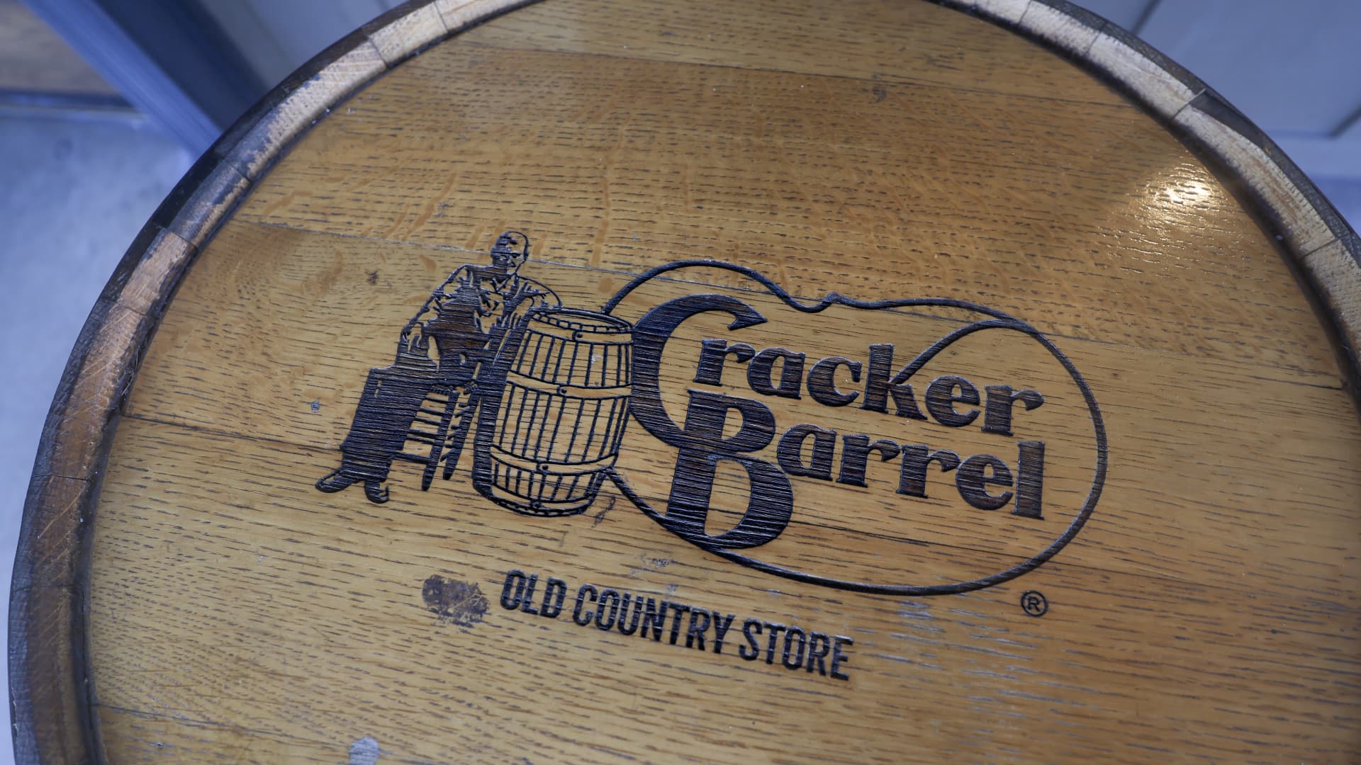
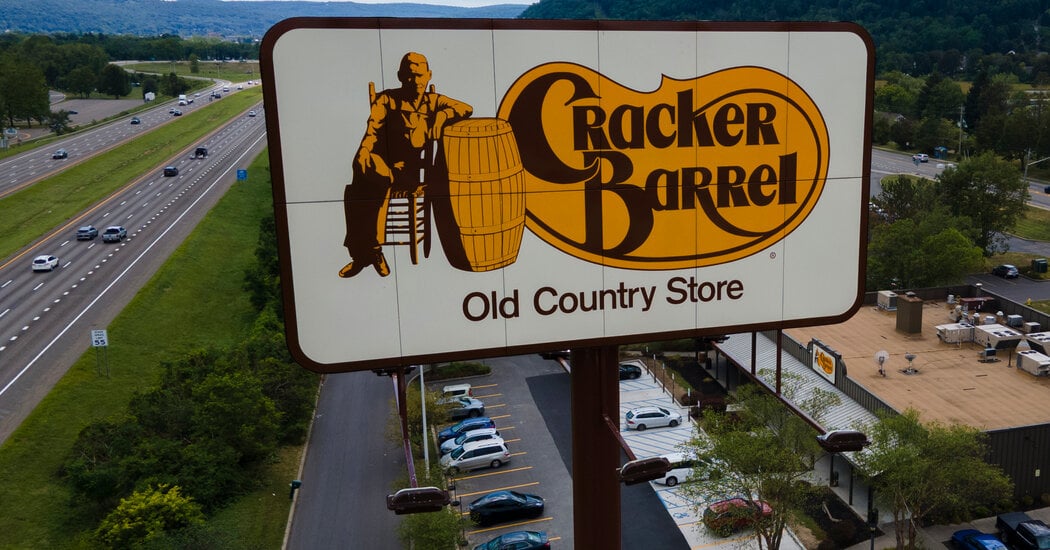
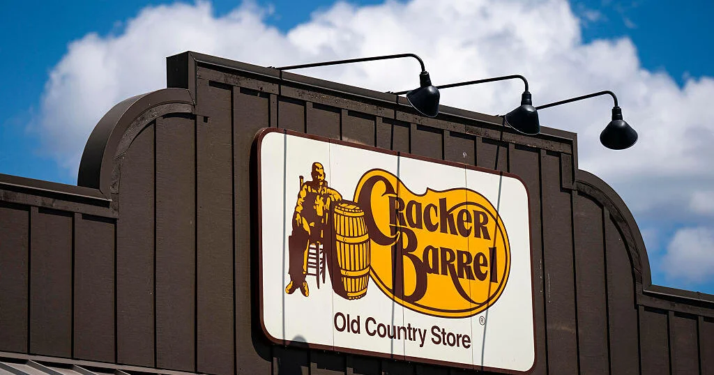
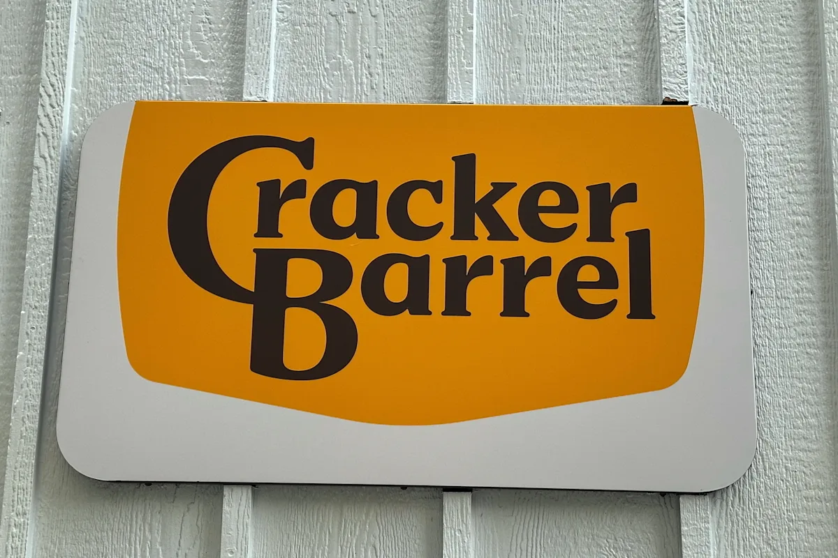
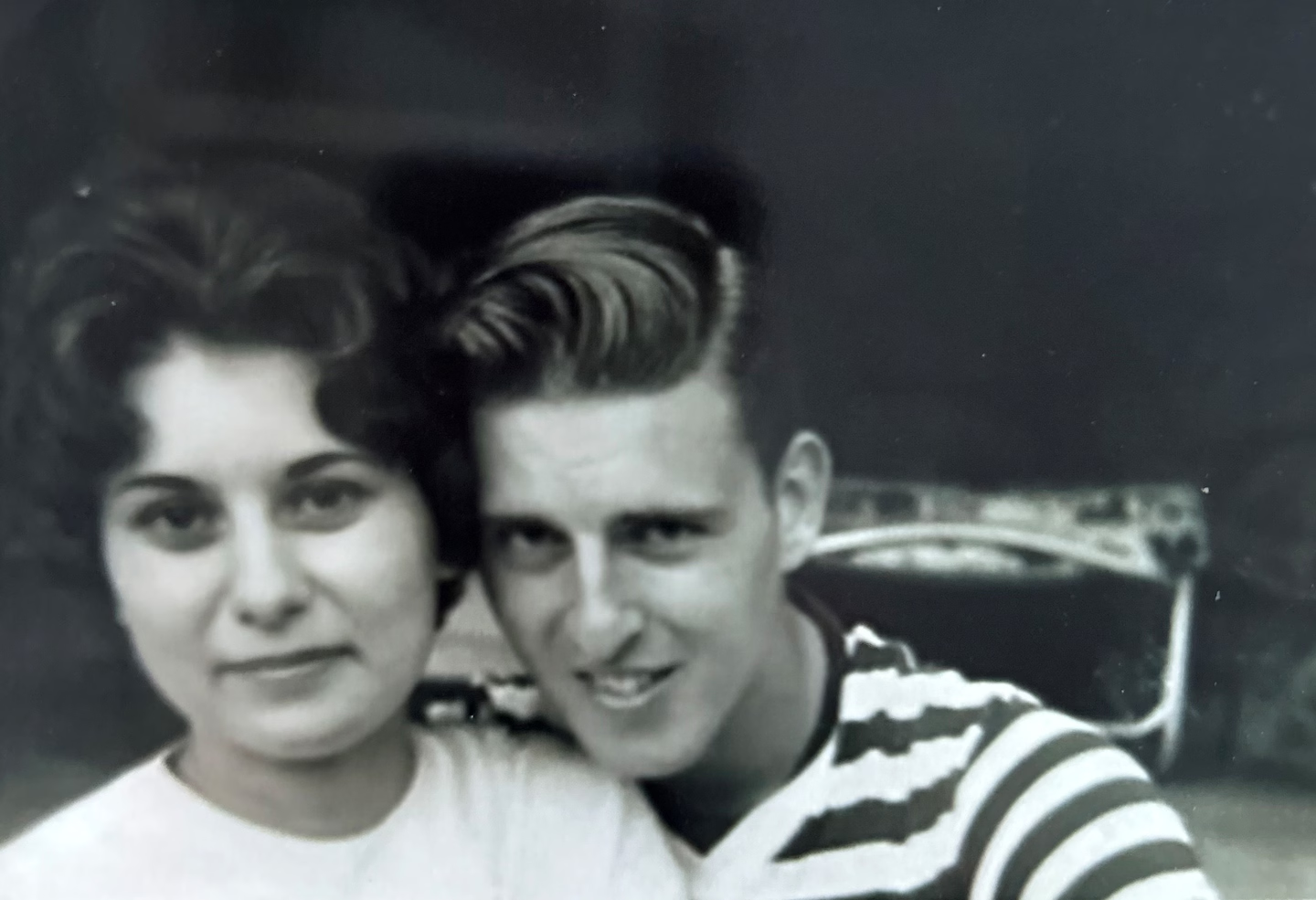
The original Cracker Barrel logo, designed by Bill Holley in 1977, has become a focal point of a culture war after the company briefly redesigned it to a more modern look, which was criticized as 'woke' by conservatives. The backlash led the company to revert to the original logo, sparking support from high-profile figures and highlighting the emotional significance of the design. Holley's wife and family expressed pride in his work, which represented his roots and legacy.

Cracker Barrel Reverts to Old Logo Following Conservative Backlash

Originally Published 4 months ago — by The New York Times

Featured image for Cracker Barrel Reverts to Old Logo Following Conservative Backlash
Source: The New York Times

Cracker Barrel decided to keep its original logo after facing significant social media backlash, including from President Trump, over its planned rebranding that aimed to modernize its look but was criticized for losing its traditional farmhouse aesthetic and for perceived wokeness. The company acknowledged the feedback and reverted to its classic logo, emphasizing its commitment to its legacy and customer base.

Cracker Barrel Reverts to Classic Logo Amid Customer Backlash

Originally Published 4 months ago — by CBS News

Featured image for Cracker Barrel Reverts to Classic Logo Amid Customer Backlash
Source: CBS News

Cracker Barrel announced it will revert to its original logo after a public backlash against its recent rebranding, which removed the iconic image of a man sitting in a chair leaning against a barrel. The company acknowledged the feedback and decided to listen to its customers, restoring the old logo to maintain its brand identity.

Apple Sues Apple Cinemas Over Trademark Dispute

Originally Published 5 months ago — by The Verge

Featured image for Apple Sues Apple Cinemas Over Trademark Dispute
Source: The Verge

Apple Cinemas, a theater chain unrelated to Apple Inc., has responded to a lawsuit from Apple alleging trademark infringement, asserting that their name reflects their geographic roots and is distinct from Apple Inc., with no intent to cause consumer confusion. The company emphasizes its long-standing independent status and commitment to growing its brand in good faith.

The Mystery Behind the Changes to the Games Workshop Logo

Originally Published 5 months ago — by Creative Bloq

Featured image for The Mystery Behind the Changes to the Games Workshop Logo
Source: Creative Bloq

The article discusses the evolution of the Games Workshop logo, a familiar symbol for fans of tabletop gaming, and how the company has shifted its branding focus from the corporate entity to the Warhammer brand to better align with its popular game products, contributing to its significant financial success.

American Conference Unveils New Brand Identity and Name Change

Originally Published 5 months ago — by On3

Featured image for American Conference Unveils New Brand Identity and Name Change
Source: On3

The American Athletic Conference has rebranded itself as the 'American Conference' to modernize its image, introducing its first-ever conference ambassador, 'Soar the Eagle,' symbolizing innovation and aspiration. The league aims to strengthen its national presence and competitive standing, emphasizing its success in college football and its distinct identity in collegiate sports.

Southwest Airlines Introduces Baggage Fees to Boost Profits

Originally Published 7 months ago — by Forbes

Featured image for Southwest Airlines Introduces Baggage Fees to Boost Profits
Source: Forbes

Southwest Airlines' decision to start charging for checked bags, ending its 'bags fly free' tradition, risks damaging customer trust and loyalty by violating key consumer psychology principles like loss aversion, brand consistency, and anchoring, potentially leading to significant long-term brand and market share losses despite short-term revenue gains.

"Dodge Charger: Embracing the Electric Muscle Era with New EV and Gas-Powered Models"

Originally Published 1 year ago — by The Autopian

Featured image for "Dodge Charger: Embracing the Electric Muscle Era with New EV and Gas-Powered Models"
Source: The Autopian

Stellantis is set to unveil the new Dodge Charger, a crucial release for the struggling brand amidst a lineup of underperforming models and a recent decision to discontinue the "Wagoneer" brand. With Dodge's identity hinging on the success of the new Charger, the company faces challenges in transitioning to electric vehicles while maintaining its performance-focused image. The unveiling on March 5 will reveal whether the new Charger can revitalize the brand and address its identity crisis.

Tubi Unveils Redesigned Look and Sound for International Expansion

Originally Published 1 year ago — by The Verge

Featured image for Tubi Unveils Redesigned Look and Sound for International Expansion
Source: The Verge

Tubi has unveiled a new playful brand identity and redesign, emphasizing its aim to have viewers fall down rabbit holes while exploring its extensive library of films and series. The update includes a fresh yellow logo, a bouncy splash animation, and a new signature musical cue, all centered around a shade of purple referred to as "turple." While the basic usability remains unchanged, the platform's new look aims to convey a "fun, bold, and engaging" energy, aligning with its marketing push towards the rabbit hole concept.

"Tubi Unveils Refreshed Brand Identity and Logo in Streaming Service Overhaul"

Originally Published 1 year ago — by Deadline

Featured image for "Tubi Unveils Refreshed Brand Identity and Logo in Streaming Service Overhaul"
Source: Deadline

Fox Corp's streaming service Tubi has unveiled a new logo and brand identity, featuring vibrant colors and a playful audio tone to reflect its "find your rabbit hole" concept. The update comes ahead of the fourth anniversary of Fox's acquisition of Tubi and has been credited with contributing to the company's increase in ad revenue. With over 74 million monthly active users and a significant share of TV viewing, Tubi's rebranding coincides with Anjali Sud's tenure as CEO and aims to provide a fun, bold, and engaging platform for viewers.

Seattle Sounders FC Embrace Past and Look to the Future with New Crest and Colors

Originally Published 2 years ago — by Sounder At Heart

Featured image for Seattle Sounders FC Embrace Past and Look to the Future with New Crest and Colors
Source: Sounder At Heart

The Seattle Sounders have unveiled a new visual identity that strikes a balance between the familiar and the updated. The new logo, created by local firm Column, features a sleek upgrade of the Space Needle, slightly tweaked colors, and a reference to the club's founding year of 1974. The rebrand also includes ancillary marks such as an orca and carnation, as well as updated word marks and a fully customized font. The design reflects the club's history while embracing a modern look, and it was influenced by feedback from fans and stakeholders. The new visual identity coincides with the club's upcoming 50th anniversary.

Facebook's Subtle Logo Change Sparks Roasting and Spot-the-Difference Challenges

Originally Published 2 years ago — by Daily Mail

Featured image for Facebook's Subtle Logo Change Sparks Roasting and Spot-the-Difference Challenges
Source: Daily Mail

Facebook has subtly changed its logo, with the biggest difference being a deeper shade of blue for the background. Other alterations include a slightly fatter 'f' and a more angled right edge. Meta, the company that owns Facebook, describes these changes as the first phase of a refreshed identity, suggesting more tweaks are on the way. Some users have expressed indifference, while others have noticed the new color as a noticeable change. Social media consultant Rhea Freeman believes subtle changes promote confidence and align with growth and evolution. The full word version of the logo has also been changed with similar tweaks. Meta also launched a new app called Threads, which resembles Twitter, allowing users to share text, links, photos, and videos.