Tubi Unveils Redesigned Look and Sound for International Expansion
TL;DR Summary
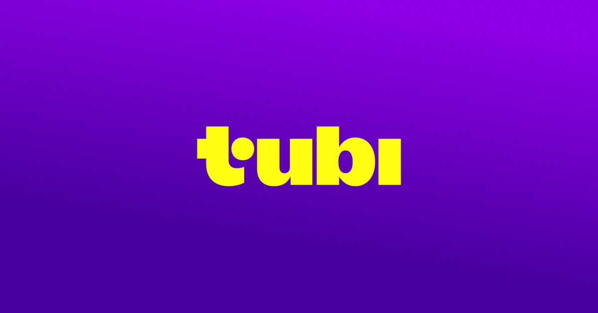
Tubi has unveiled a new playful brand identity and redesign, emphasizing its aim to have viewers fall down rabbit holes while exploring its extensive library of films and series. The update includes a fresh yellow logo, a bouncy splash animation, and a new signature musical cue, all centered around a shade of purple referred to as "turple." While the basic usability remains unchanged, the platform's new look aims to convey a "fun, bold, and engaging" energy, aligning with its marketing push towards the rabbit hole concept.
- Tubi's new redesign wants to push you down the rabbit hole The Verge
- Tubi Gets New Logo, Sonic Brand ID as It Gears Up for International Expansion Variety
- Fox Corp. Streaming Service Tubi Introduces New Logo And Brand Identity Deadline
- Tubi rebrands to appeal to Gen Z TV viewers Ad Age
- Why Tubi Is Updating Its Whole Look (and Sound) Vulture
Reading Insights
Total Reads
0
Unique Readers
1
Time Saved
1 min
vs 2 min read
Condensed
69%
275 → 86 words
Want the full story? Read the original article
Read on The Verge