Cracker Barrel's Logo Change Sparks Culture War and Investor Action
TL;DR Summary
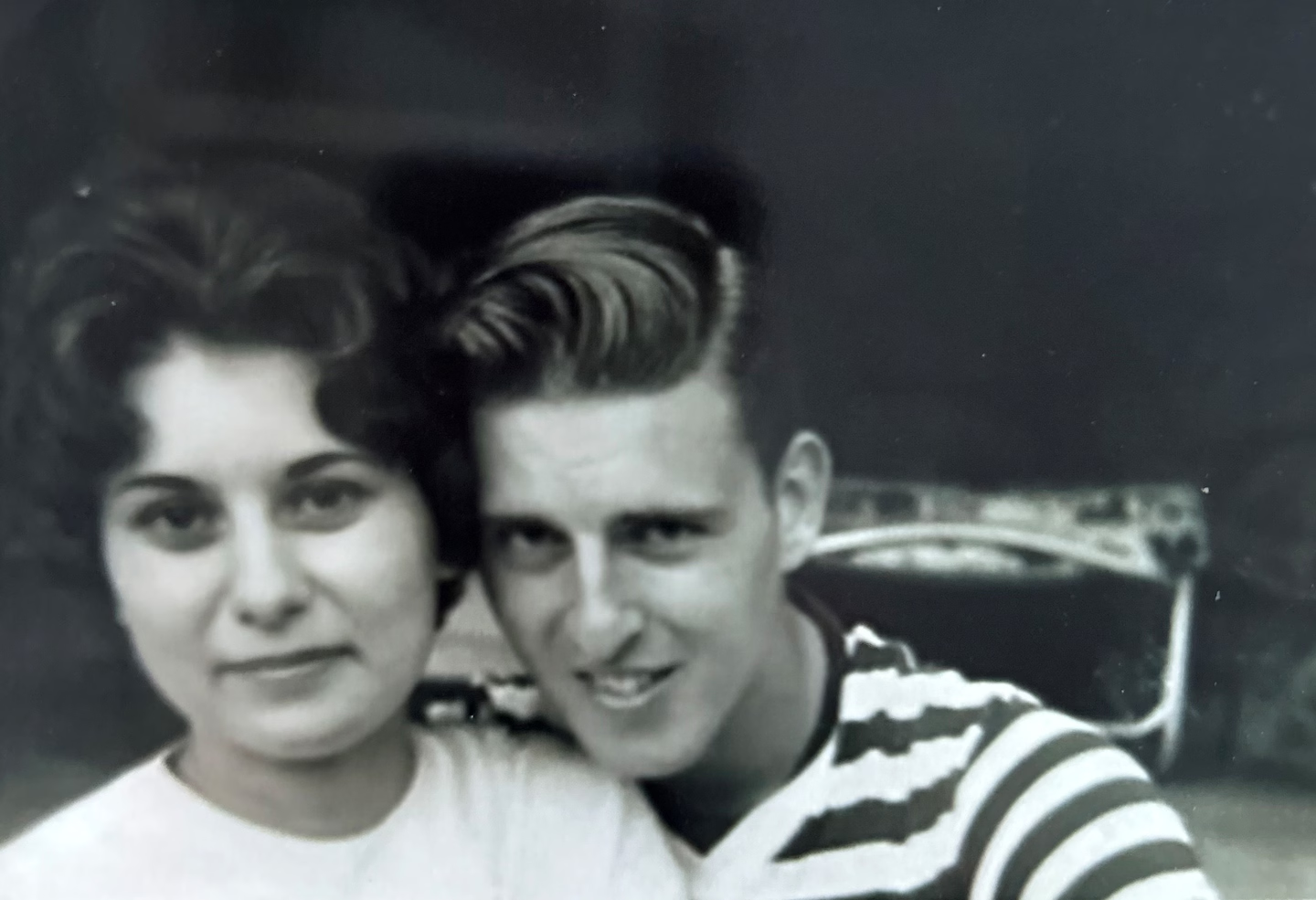
The original Cracker Barrel logo, designed by Bill Holley in 1977, has become a focal point of a culture war after the company briefly redesigned it to a more modern look, which was criticized as 'woke' by conservatives. The backlash led the company to revert to the original logo, sparking support from high-profile figures and highlighting the emotional significance of the design. Holley's wife and family expressed pride in his work, which represented his roots and legacy.
Topics:top-news#brand-identity#cracker-barrel-logo#culture#culture-war#design-controversy#social-media-backlash
- He designed the Cracker Barrel logo. Now it’s caught in a culture war. The Washington Post
- Cracker Barrel customers in the company's hometown weigh in on logo: 'If something's not broke, don't fix it' Fox Business
- Cracker Barrel had good reasons to rebrand. But after its new logo misfired, here's what's next AP News
- After right-wing backlash, Cracker Barrel says it will get rid of its new logo CNN
- After Cracker Barrel Uproar, Activist Investor Seizes the Moment The Wall Street Journal
Reading Insights
Total Reads
0
Unique Readers
1
Time Saved
3 min
vs 4 min read
Condensed
90%
771 → 77 words
Want the full story? Read the original article
Read on The Washington Post