Graphic Design News
The latest graphic design stories, summarized by AI
Featured Graphic Design Stories

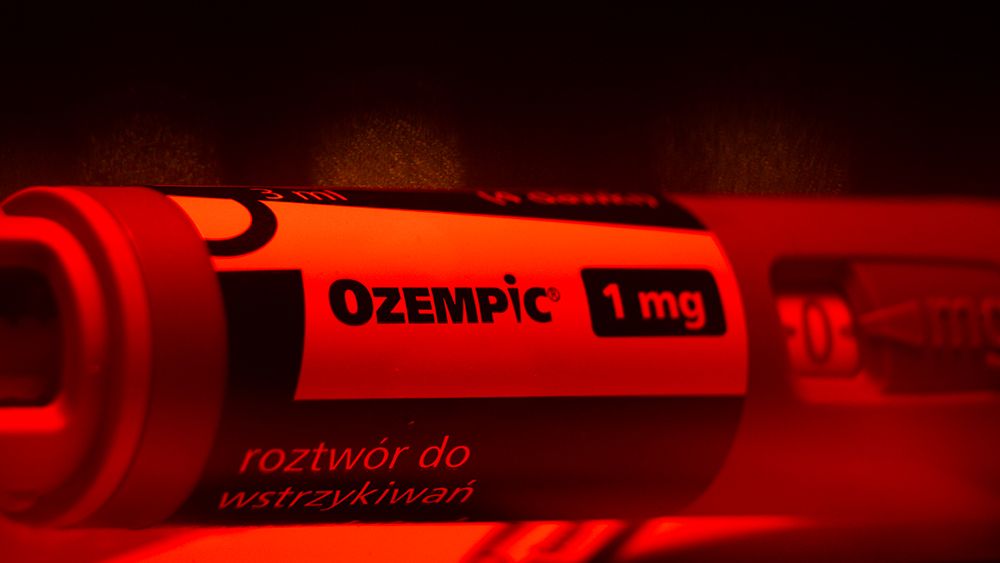
Decoding the Controversial Message in Ozempic's Logo
The logo for Novo Nordisk's diabetes medication, Ozempic, has a clever design that resembles both a needle and a human figure with a slim waist. While the logo has received praise for its creativity, some have raised concerns about promoting an unhealthy relationship with weight, as Ozempic is not approved for weight loss. Despite this controversy, the logo has become popular and recognizable.

More Top Stories
"MacBook Air: Optical Illusions, Missed Opportunities, and Buying Decisions"
Creative Bloq•2 years ago
The Rise of AI in Album Cover Art and Photoshop Tools.
Creative Bloq•2 years ago
More Graphic Design Stories
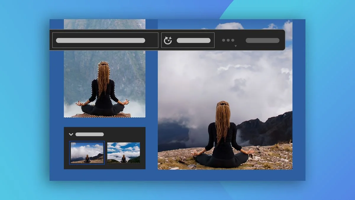
The Game-Changing Power of Photoshop's AI Generative Fill.
Adobe's Firefly generative AI model has been integrated into the beta version of Photoshop, introducing various features including a new Remove tool and enhanced gradients. However, the most impressive feature is the Generative Fill, which allows users to select a portion of an image and fill it with new imagery generated using a text prompt. This AI-powered tool is already transforming artists' workflows and receiving positive feedback on Twitter. With Adobe promising to "do the right thing" in terms of ethics and copyright, Firefly could be the future of AI art.
Mixed Reviews for Warner Bros. Discovery's 'Max' Streaming Rebrand
Streaming service HBO Max has undergone a rebrand and is now simply called Max, combining the offerings of Discovery+ and the original HBO Max. The removal of the HBO name from the branding has caused controversy among TV fans, who mourn the loss of the prestige associated with the brand. The new Max logo has been well-received, but the addition of the tagline "The one to watch for HBO" has been criticized as inelegant.
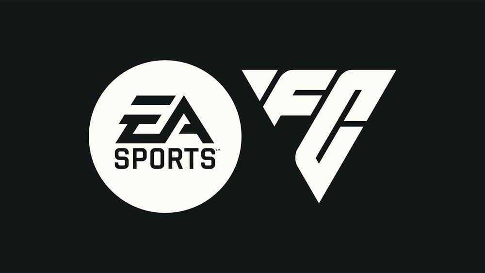
"EA Sports FC: Logo and Future Plans Unveiled"
EA Sports has revealed the new logo design for its post-FIFA football game, now called EA Sports FC, which takes inspiration from the triangle formed by players' passes. However, fans are confused and unimpressed, with some suggesting the sharp angles make it look more like a logo for a racing game, while others are unsure what letters the logo represents.
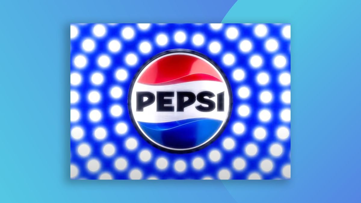
Pepsi's Refreshing New Look: A Nostalgic Logo Reimagined.
Pepsi has unveiled its first major rebrand in 15 years, featuring a new logo with a retro feel. The iconic 'globe' design has been straightened out, and the wordmark is now a bold, upper-case sans serif in the middle of the logo. The new version features bold, black text, designed to highlight a move away from high sugar content. Standard Pepsi will now contain 57% less sugar. The initial response to Pepsi's new logo seems largely positive, with many praising it as a modern nod to the past.

"Canadian Space Agency Unveils Refreshingly Unique Logo"
The Canadian Space Agency has unveiled a new logo design featuring a maple leaf and three stars, departing from the usual tropes in the sector. The design is intended to communicate "daring invention and our sights set on the future, ready to push the boundaries of ingenuity and innovation." The new logo is a lot cleaner than the agency's previous effort, taking a reduced, simplified approach. Despite its simplicity and the lack of shadows or swooshes, it manages to give the impression that the Maple leaf is taking flight by the way it tapers towards the stars below it.
