Pepsi's Refreshing New Look: A Nostalgic Logo Reimagined.
TL;DR Summary
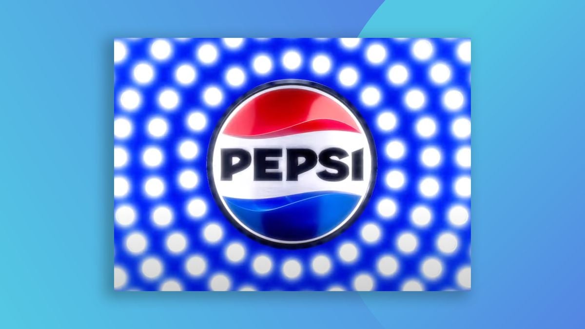
Pepsi has unveiled its first major rebrand in 15 years, featuring a new logo with a retro feel. The iconic 'globe' design has been straightened out, and the wordmark is now a bold, upper-case sans serif in the middle of the logo. The new version features bold, black text, designed to highlight a move away from high sugar content. Standard Pepsi will now contain 57% less sugar. The initial response to Pepsi's new logo seems largely positive, with many praising it as a modern nod to the past.
Reading Insights
Total Reads
0
Unique Readers
8
Time Saved
3 min
vs 3 min read
Condensed
85%
594 → 88 words
Want the full story? Read the original article
Read on Creative Bloq