Uber has expanded its senior accounts with larger fonts, simplified design, and additional features like saved destinations and caregiver access, now available across the US and select international markets, aiming to improve accessibility for older users.
Digital mental health interventions (DMHIs) like apps for mental health support face a significant challenge: low user engagement, with 96% of users abandoning them within 15 days. Benjamin Kaveladze argues that the design of these apps needs a complete overhaul, moving away from traditional models to more innovative and engaging solutions. By collaborating with experts in behavior change and exploring new ideas through initiatives like crowdsourced studies, the field can develop more effective and appealing DMHIs. This shift requires a focus on creativity, rigorous evaluation, and ensuring safety and effectiveness before public release.
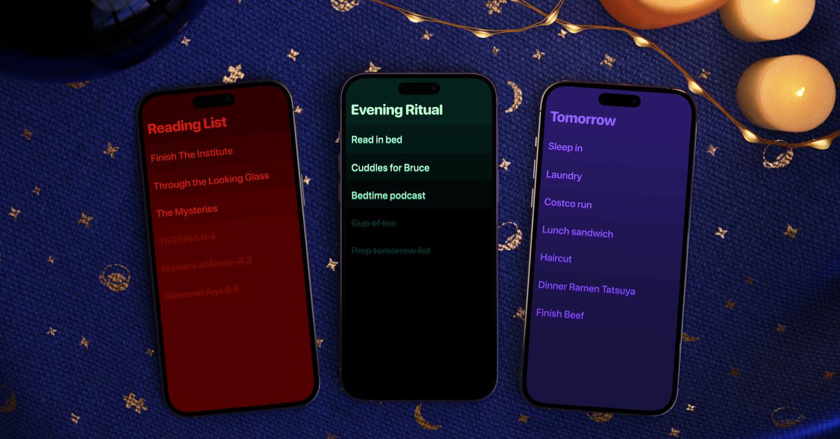
Clear 2, a whimsical to-do list app, is relaunched a decade after its initial release, featuring the same minimalist and charming design with new personalization options. The app, now owned by Impending, offers a free experience with plans for monetization through personalization features like themes, fonts, and icons. While it may not have cross-device sync yet, Clear 2 aims to provide a private and delightful space for users' thoughts and lists, emphasizing its unique design and user experience.
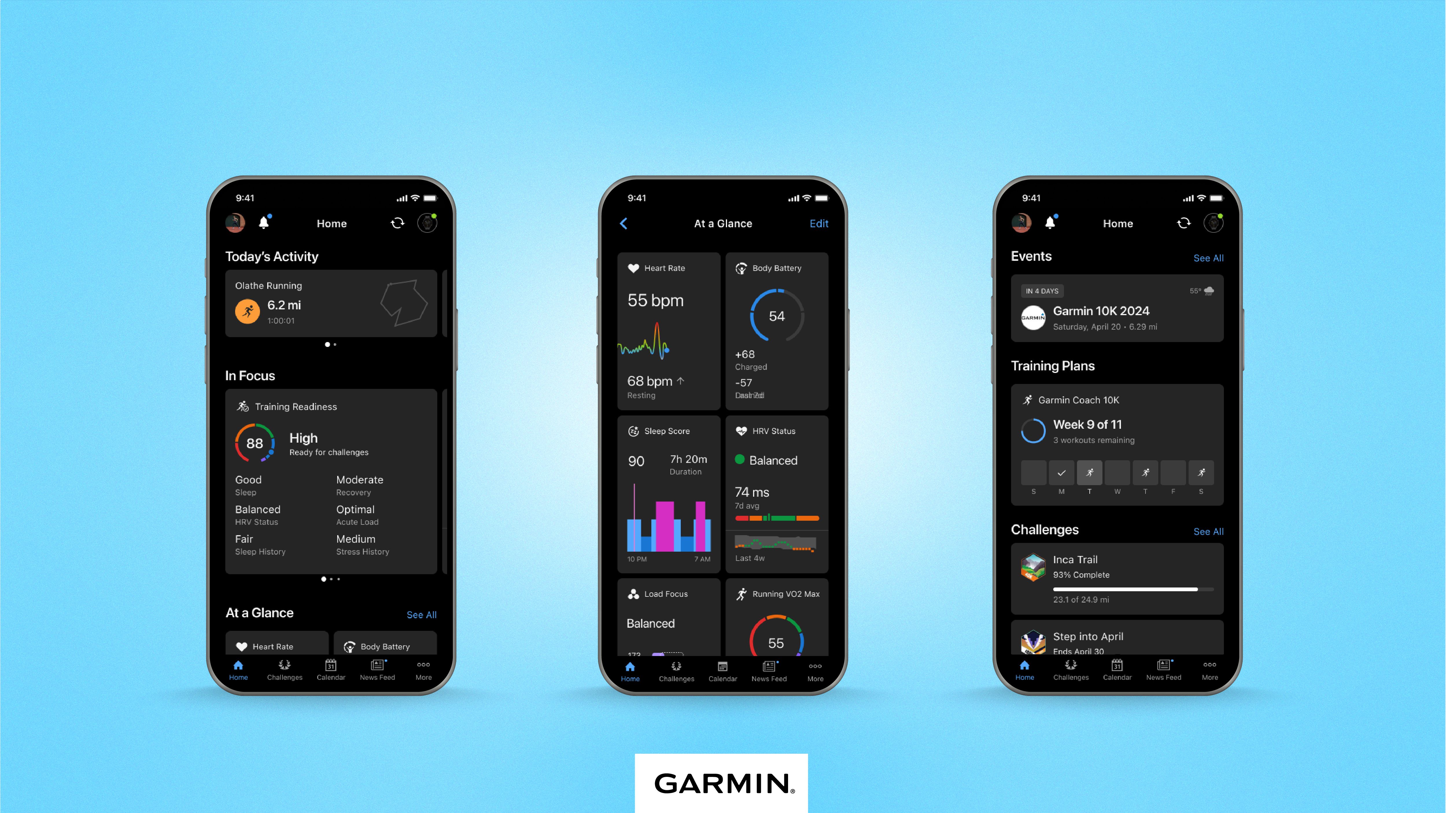
Garmin is rolling out a "simplified design" for its Garmin Connect app and website, addressing criticisms of its previous interface. The new design, currently in beta testing for select customers, aims to improve user experience and compete with rivals like Apple in the fitness tracking market.
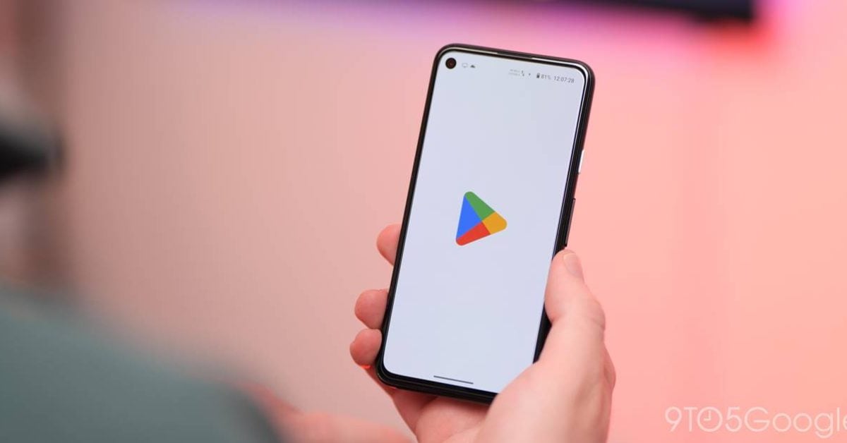
Google is testing a redesign of the Google Play Store, which has resulted in the search bar disappearing for some users. The new design features a dedicated Search page, but users are experiencing difficulties finding specific apps. The changes are server-side and have not rolled out widely yet. Users can try tapping on suggested apps or clearing the app's data as temporary solutions.
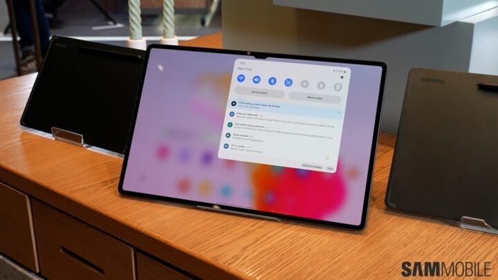
Google has updated the Gmail app for Android tablets with a new design that features a navigation rail on the left side of the screen, replacing the bottom bar. The navigation rail includes buttons for various functions such as compose email, Gmail, Chats, Spaces, and Meet video calls. The change takes advantage of the larger screen real estate on tablets and is currently being rolled out to users. Google's efforts to improve the operating system and stock apps for tablets and foldable phones are aimed at encouraging better-designed apps from third-party developers as well.
Google Maps' new color scheme, which includes various shades of gray for roads and a different look for parks and city blocks, has drawn criticism from online commentators. Users have expressed dissatisfaction with the changes, stating that the roads are harder to see and that the water and land colors are too similar. Some have also criticized the cluttered overlay on the map. The new design has been described as colder, less accurate, and less user-friendly, with suggestions that Google Maps should have followed the simpler and more visually appealing design of Apple Maps.
Google Maps' new design, including a change in color scheme, has received criticism from users, including a former Google Maps designer. Some users feel that the new color palette makes the app look "colder" and "less human," while others find it unrecognizable. The former designer expressed disappointment with the new design, stating that it feels less accurate and missed an opportunity for improvement. However, some users appreciate the increased contrast and find it more visually pleasing. Overall, the design update has sparked mixed reactions among Google Maps users.
An image of Fitbit's "new app design" has emerged from a help article, showing minor changes to the Today feed and a new design for the Discover tab. The redesign was originally expected to launch alongside the Pixel Watch last fall, but was pulled from app stores in January. The new design may be more focused on laying the groundwork for future capabilities rather than radical changes. Fitbit for Android and iOS would benefit from a redesign that brings it in line with other Google apps.
Uber CEO Dara Khosrowshahi became an Uber driver himself to experience the issues drivers face and improve the app for them. His experience showed him the app's bad design, tip baiting, and the stress of rider reviews. The experiment led to positive changes in the app, resulting in higher revenue and profit for the company. However, the changes should be followed by substantial benefits for drivers.
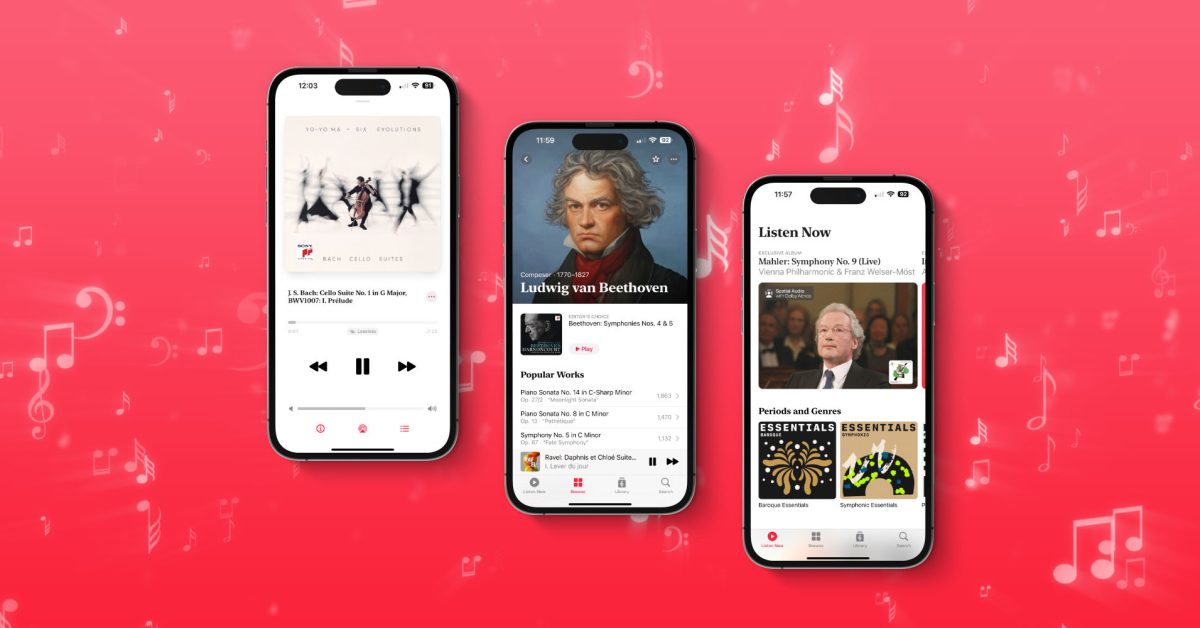
Apple Music Classical, the new standalone app focused on classical music, will be available to users on March 27. The app has a streamlined interface to help users discover and find classical music, with a catalog of five million tracks and thousands of exclusive albums. The app includes the highest audio quality (up to 192 kHz/24 bit Hi-Res Lossless) and complete and accurate metadata. The app is divided into four tabs: For You, Browse, Library, and Search, and has a lot of code and frameworks coming from the Primephonic app.