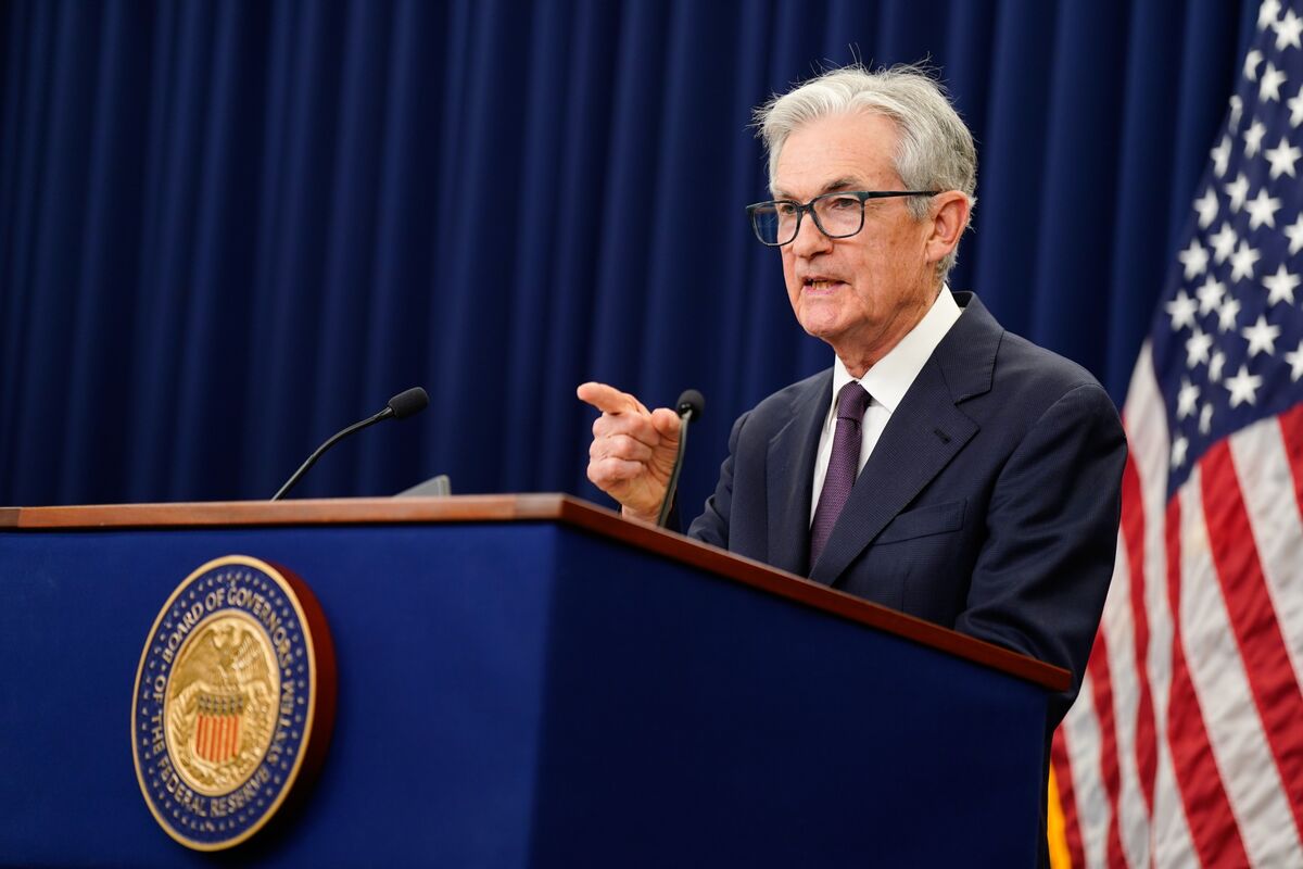
Fed's Dot Plot Indicates Cautious Rate Cuts and Economic Optimism

TL;DR Summary
The dot plot is a quarterly scatter chart used by the Federal Reserve to project future interest rates, reflecting the views of FOMC members on the appropriate federal funds rate over the coming years. While it provides insight into policymakers' expectations and can influence market perceptions, it is not an official consensus forecast and lacks transparency about individual contributions, leading to mixed opinions among Fed leaders and critics.
- The Dot Plot, Explained: How the Fed Forecasts Interest Rates Bloomberg
- Fed forecasts only one rate cut in 2026, a more conservative outlook than expected CNBC
- Fed signals 2 more cuts in 2025, raises GDP forecast for the year Yahoo Finance
- Fed Telegraphs More Cuts But Falls Short of Market Expectations TheStreet Pro
- The Fed's dot plot shows one member wants to cut rates like crazy by the end of the year Business Insider
Reading Insights
Total Reads
0
Unique Readers
1
Time Saved
3 min
vs 4 min read
Condensed
90%
703 → 68 words
Want the full story? Read the original article
Read on Bloomberg