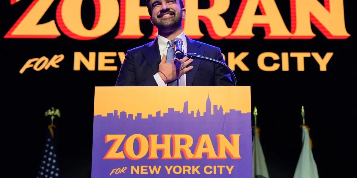
A Philadelphia-based graphic designer created vibrant, culturally inspired campaign visuals for Zohran Mamdani's NYC mayoral run, drawing from local small business aesthetics and cultural references, which helped make his campaign memorable and distinctive in a crowded field.
Google is expanding its new gradient 'G' icon, introduced in May for Search, to be used company-wide to symbolize AI-driven innovation and the company's evolution, replacing the old logo across more products and platforms.
The author questions whether the fifth-generation Volkswagen Jetta and the ninth-generation Toyota Corolla are basically the same car, and asks readers to share their opinions on which cars look suspiciously like their rivals or competitors. The rise of crossovers has led to many cars resembling each other due to similar design constraints and benefits. Designers resort to creases, lines, LEDs, and big grilles to distinguish their cars and give them a unique visual identity.
Pepsi has unveiled a new logo that aligns with what people already think of when they think about the brand. The redesign was prompted by the fact that people would often try to put the word "Pepsi" inside the logo mark, despite the word mark and logo being separate for the past 14 years. The lesson here is that there is a difference between the way a company thinks about its brand and the way its customers think about it. A logo is just a visual cue to remind customers of their experiences with a product and create familiarity.
PepsiCo has announced a refresh of the Pepsi logo for the first time in 14 years, with the name Pepsi appearing inside the globe with a "modern, custom" font. The stripes inside the circle have been altered and rotated, with the colors getting an update as well. The new design will feature a "new visually distinct can silhouette" and the "signature Pepsi pulse." The first consumers to experience the new logo and visual identity will be those in North America, with a fall launch for the brand's 125th anniversary. The rest of the world will see it in the following year.
PepsiCo has announced a refresh of the Pepsi logo for the first time in 14 years, with the name Pepsi appearing inside the globe with a "modern, custom" font. The stripes inside the circle have been altered and rotated, with the colors getting an update as well. The new visual identity design also features a "new visually distinct can silhouette" and the "signature Pepsi pulse." The first consumers to experience the new logo and visual identity will be those in North America, with a fall launch for the brand’s 125th anniversary.