Pepsi's Logo Gets a Refresh After 15 Years.
TL;DR Summary
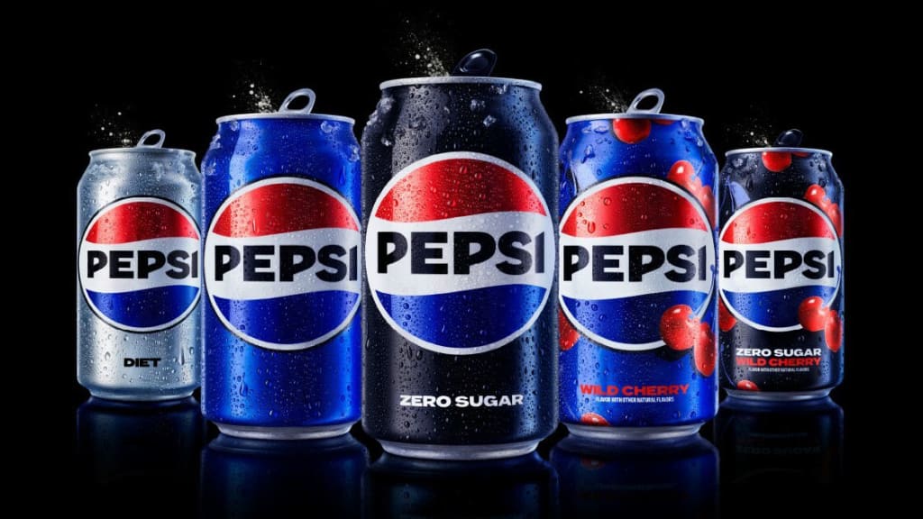
Pepsi has unveiled a new logo that aligns with what people already think of when they think about the brand. The redesign was prompted by the fact that people would often try to put the word "Pepsi" inside the logo mark, despite the word mark and logo being separate for the past 14 years. The lesson here is that there is a difference between the way a company thinks about its brand and the way its customers think about it. A logo is just a visual cue to remind customers of their experiences with a product and create familiarity.
- After 14 Years, Pepsi Has a New Logo and It Finally Fixes 1 of the Biggest Problems Facing Every Company Inc.
- Pepsi rebrands with new logo ahead of 125th anniversary Arab News
- Pepsi Refreshes Its Logo for the First Time in 15 Years Muse by Clio
- Pepsi's Rebrand Takes the Gen-Z(ero) Challenge Bloomberg
- Bridging skills gaps and Pepsi's new logo: Your Marketing Week Marketing Week
Reading Insights
Total Reads
0
Unique Readers
8
Time Saved
2 min
vs 3 min read
Condensed
83%
581 → 99 words
Want the full story? Read the original article
Read on Inc.