Pepsi's Logo Evolution: From Ridiculous to Retro
TL;DR Summary
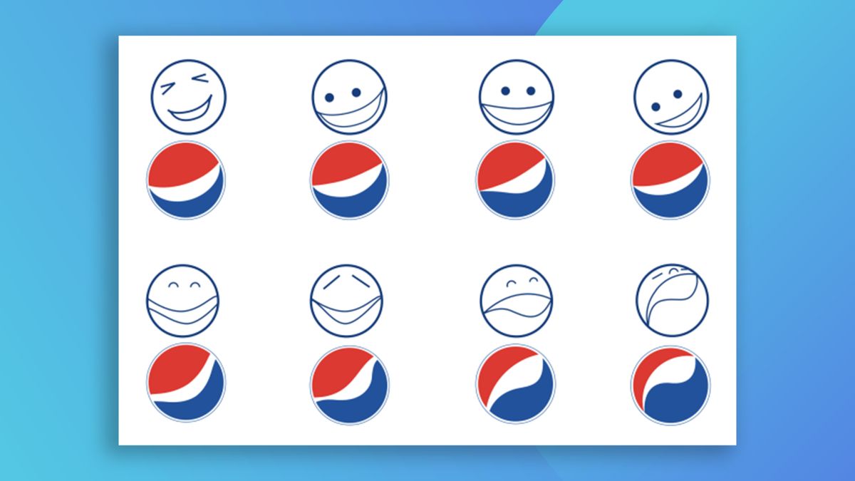
With Pepsi announcing a new logo, people are saying goodbye to the divisive slanted 'globe' introduced in 2008, as well as the infamous design document created by New York-based brand consultancy agency Arnell Group. The leaked PDF offers a mind-boggling glimpse into Pepsi's million-dollar rebrand from 2008, with claims that the logo is based on the Mona Lisa and takes inspiration from the exponential expansion of the universe. Despite some believing it's a hoax, the 27-page document remains one of the most outrageous in the world of graphic design.
- Never forget that utterly ridiculous Pepsi logo design document Creative Bloq
- Pepsi has a new logo CNN
- Pepsi unveils new retro logo! Abccolumbia.com
- Pepsi announces it's made major change to iconic drink LADbible
- Pepsi gets a new logo CNN
Reading Insights
Total Reads
0
Unique Readers
0
Time Saved
3 min
vs 4 min read
Condensed
85%
602 → 89 words
Want the full story? Read the original article
Read on Creative Bloq