Pepsi's Bold New Logo Taps into Gen Z Nostalgia.
TL;DR Summary
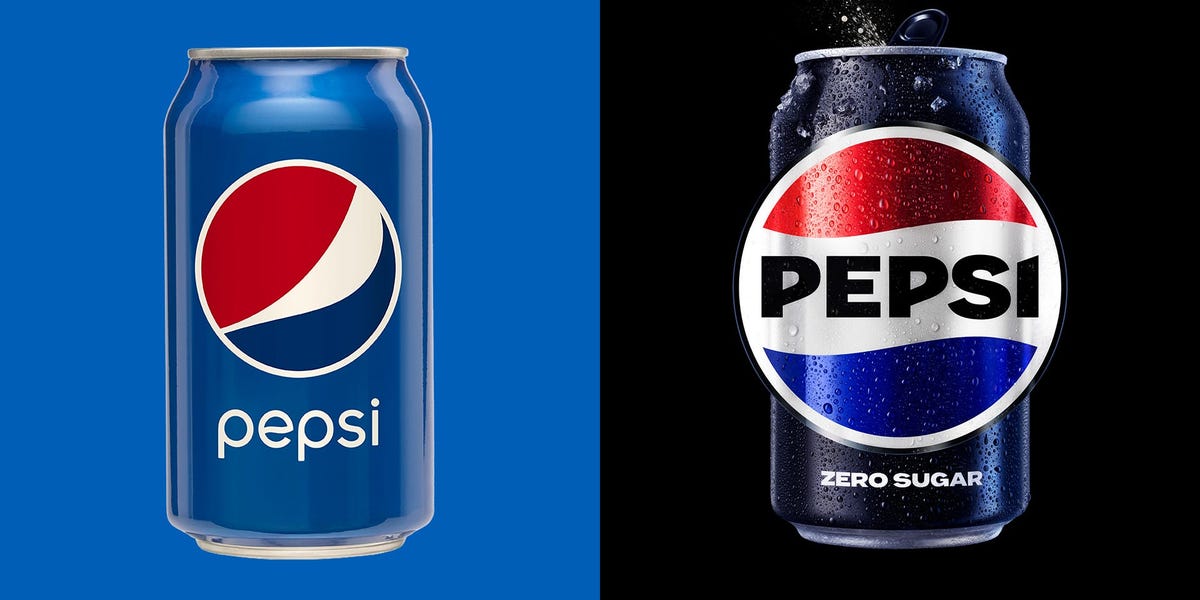
Pepsi has unveiled a new logo that closely resembles its '90s design, tapping into the rising popularity of the era among Gen Zers. The redesign goes against the recent trend of minimalist logos with little-to-no identity. The new emblem features a more standard striped pattern with the wording placed inside, and is expected to roll out in North America this fall before being offered around the world in 2024. The return to the '90s emblem also goes against the trend of modernizing logos with simplified designs.
- Pepsi's new logo inspired by '90s design, taps Gen Z nostalgia Business Insider
- Pepsi's new logo—what designers like (and don't like) about the refresh AdAge.com
- Pepsi unveils new logo after 14 years The Hill
- 'Bold and confident': Pepsi has a new logo KSL.com
- Pepsi unveils a new logo: a look back at the logos through the years | Advertising Campaign Asia
Reading Insights
Total Reads
0
Unique Readers
0
Time Saved
2 min
vs 3 min read
Condensed
79%
417 → 86 words
Want the full story? Read the original article
Read on Business Insider