Jell-O's Refreshed Image Appeals to Younger Generation with a 'Jiggly Goodness'
TL;DR Summary
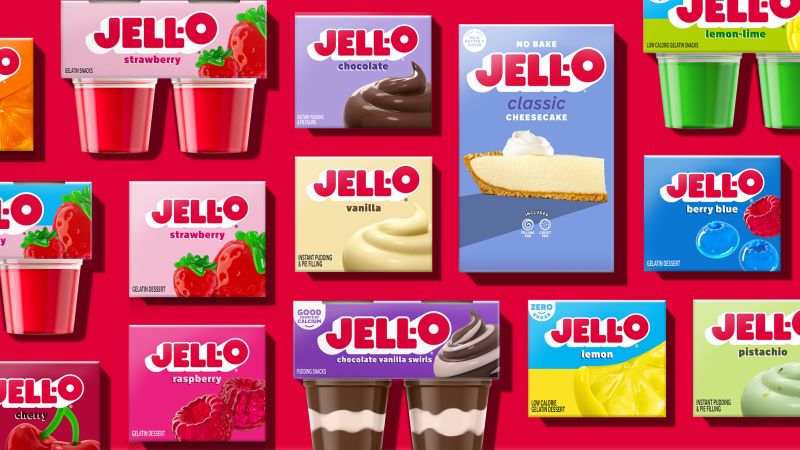
Jell-O is undergoing a makeover with a new logo and packaging, its first in a decade, as owner Kraft Heinz aims to revitalize the brand. The redesigned packaging features a bigger logo, more colorful design, and a stronger emphasis on its "zero sugar" appeal. The new look aims to appeal to younger consumers and create a more contemporary image. Jell-O's sales have been declining, and the brand hopes that the refresh will attract new customers, although it remains to be seen if it will translate into increased sales.
- Jell-O’s new look emphasizes its ‘jiggly goodness’ CNN
- Jell-O gets ‘bold’ new look for the first time in 10 years AOL
- Jell-O Unveils New Logo And Packaging For The First Time In 10 Years The Drum
- Jell-O rebrands to attract younger parents and kids AdAge.com
- Jell-O Got A Face Lift For The First Time In 10 Years Southern Living
- View Full Coverage on Google News
Reading Insights
Total Reads
0
Unique Readers
1
Time Saved
3 min
vs 4 min read
Condensed
87%
679 → 88 words
Want the full story? Read the original article
Read on CNN