"Insightful Maps: Revealing the True Size and Meaning of Earth's Countries"
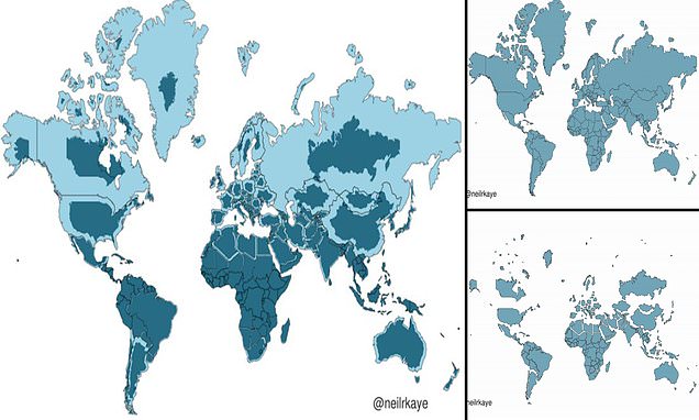
A climate data scientist at the Met Office has created a two-dimensional representation of what the world really looks like, revealing that many countries, including Russia, Canada, and Greenland, are not nearly as big as we think. This phenomenon can be attributed to the Mercator projection, a map most commonly seen hanging in classrooms and in textbooks, which was created in 1596 to help sailors navigate the world. It gives the right shapes of land masses, but at the cost of distorting their sizes in favour of the wealthy lands to the north. Africa is actually three times the size of North America and also significantly larger than Russia, despite the opposite appearing true when looking at a map.