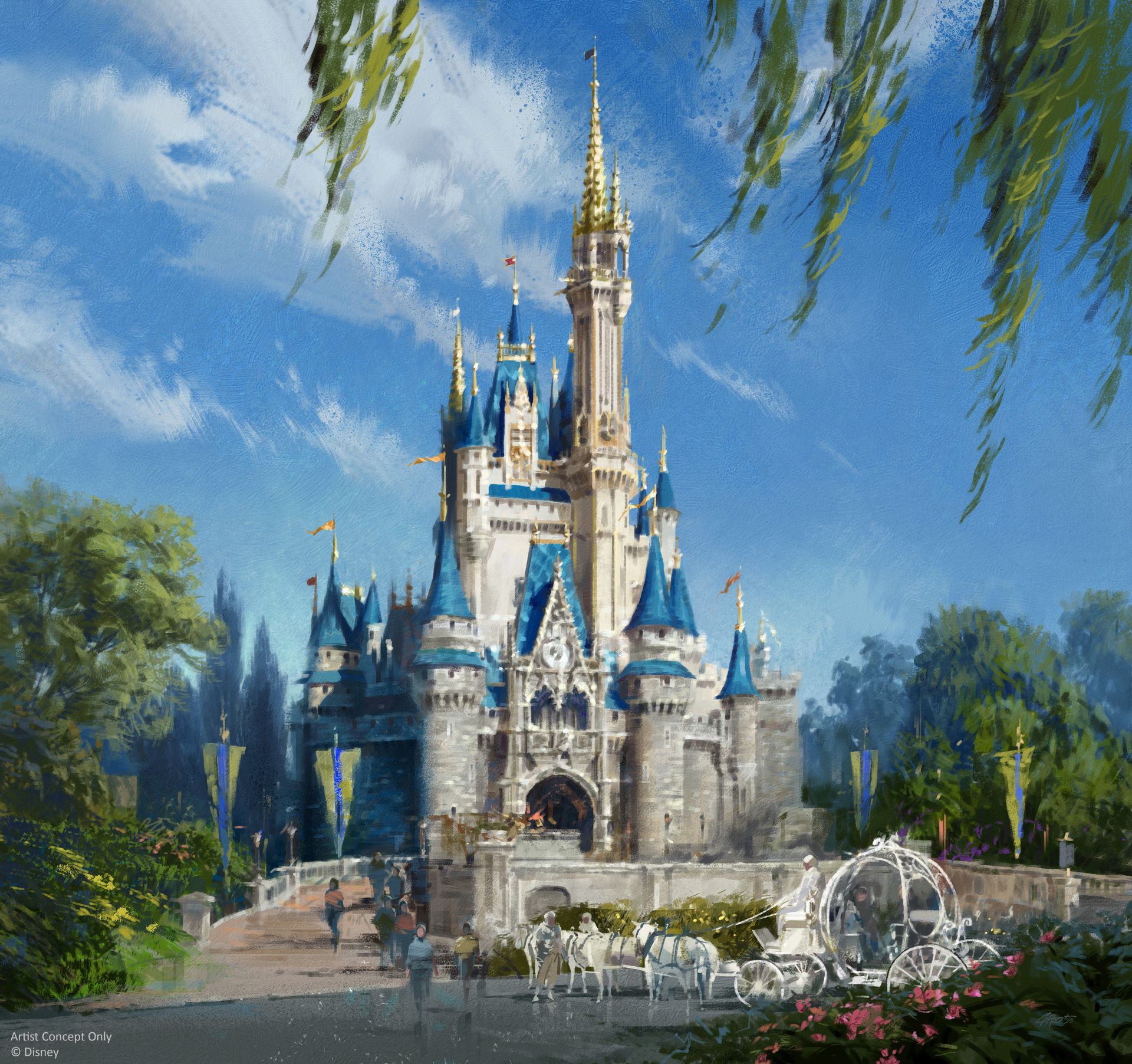
Disney is restoring Cinderella Castle at Magic Kingdom to its original 1971 look, featuring classic grays, creams, and blues with gold accents, using modern materials and weather-resistant finishes to preserve its iconic appearance.
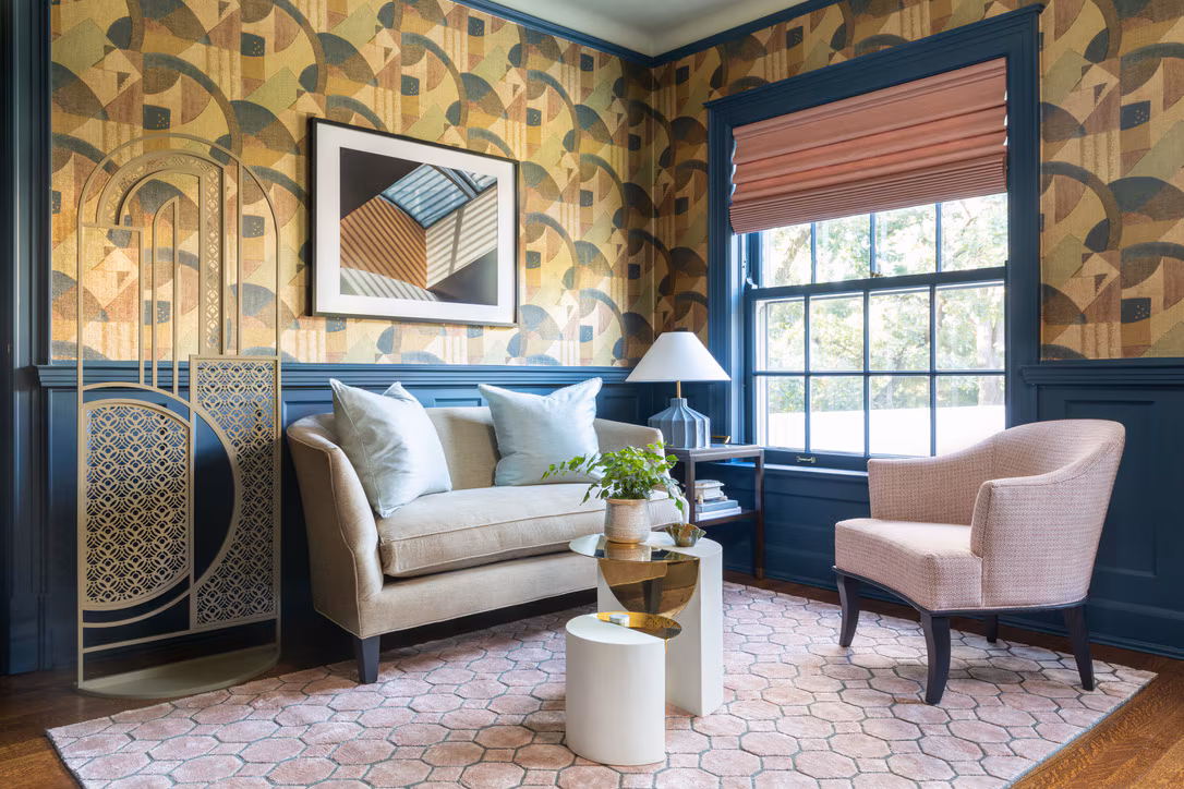
The article explores various bold and neutral trim colors recommended by professional designers to refresh room aesthetics, emphasizing the importance of choosing a statement color for trim to add character and cohesion to interior spaces, with tips on selecting hues based on architectural features and existing decor.
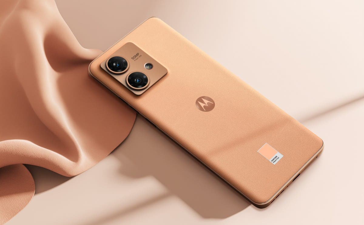
Motorola has introduced the Peach Fuzz edition for its razr 40 ultra and edge 40 neo smartphones, expanding the color options available. The gentle peach hue represents togetherness and collaboration, aligning with Motorola's mission to foster meaningful connections through technology. The pricing remains unchanged, and the phones are set to ship from December 12th. The new color aims to enhance the human-device connection and bridge the gap between the virtual and real worlds.
Google Maps has introduced a new color palette, which has received mixed reactions from users. The changes include a brighter mint green for parks and forests, a colder shade of blue for water, and gray roads. Some users appreciate the improved visibility of parks and forests, as well as the clearer differentiation between locations and road names. However, others find the new colors cold and uninviting, and criticize the confusion caused by the translucent blue used for alternate routes. Former Google Maps designer Elizabeth Laraki also expressed concerns about the cluttered design. Overall, opinions on the new color palette vary, and users are encouraged to share their thoughts.
Google Maps is rolling out a new color palette for its UI, bringing a refreshing look to the popular navigation app. The update includes lighter shades of green for parks and nature, new colors for roads and buildings, and darker freeways with blue undertones. The new color scheme aims to make elements within Google Maps more distinguishable and provide a cleaner and streamlined view. The update is being rolled out widely for Android and iOS users.
Google Maps is testing an updated color palette for its background map layer, featuring lighter blue water, darker green nature areas, and gray roads, drawing comparisons to Apple Maps. The changes aim to improve visibility and thematic unity. The new colors are currently being tested on Android devices, and Google may make further adjustments before a wider launch.