Google's Gemini Gets a Colorful Makeover and New Features
TL;DR Summary
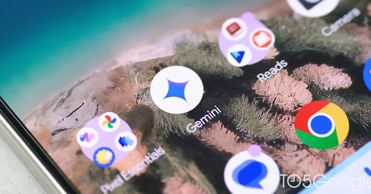
Google is updating the Gemini app icon to a four-color design that aligns more closely with its primary brand colors, reflecting increased confidence in the chatbot, though it may reduce visual distinction among Google apps. The new icon, currently seen in beta on Android, features a four-pointed sparkle with a gradient effect, signaling a branding shift to make Gemini appear more integrated with Google's overall aesthetic.
- Gemini sparkle icon getting the four-color Google treatment 9to5Google
- Google's baking even more tools into Gemini Live's upcoming compact overlay (APK teardown) Android Authority
- Google is working on a new Gemini logo with familiar colors Yahoo
- Check out Gemini's new avatar in Google colors ahead of its official rollout (APK teardown) Android Authority
- Gemini's homescreen could take this idea from its biggest rival (APK teardown) Android Authority
Reading Insights
Total Reads
0
Unique Readers
1
Time Saved
2 min
vs 2 min read
Condensed
82%
377 → 66 words
Want the full story? Read the original article
Read on 9to5Google