"Ford's Subtle Logo Change Goes Unnoticed"
TL;DR Summary
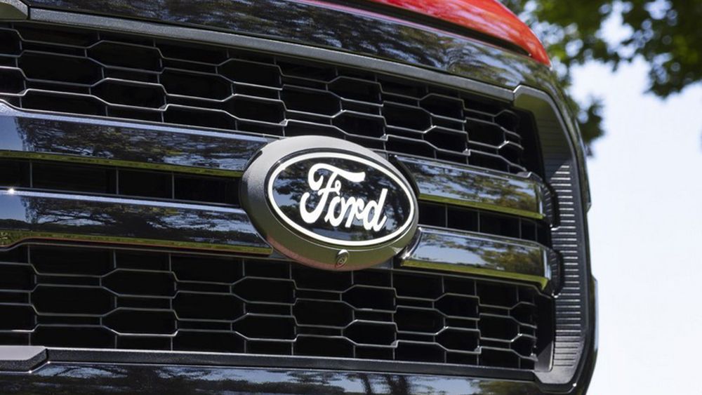
Ford has quietly unveiled a new logo for its F-150 pickup truck, featuring a simplified design reminiscent of its classic logo from the 1960s. The new logo drops the chrome finish and uses a larger application of the script with simple white accents. While the change may go unnoticed by some, it reflects the trend among car makers to adopt simpler, flatter designs for their logos. Ford's logo redesign follows in the footsteps of other major car manufacturers who have already made similar changes.
Ford changed its logo, and we almost didn't notice Creative Bloq
Reading Insights
Total Reads
0
Unique Readers
5
Time Saved
2 min
vs 3 min read
Condensed
82%
479 → 84 words
Want the full story? Read the original article
Read on Creative Bloq