"Decades-Long Battle Reflected in Highway Sign Fonts"
TL;DR Summary
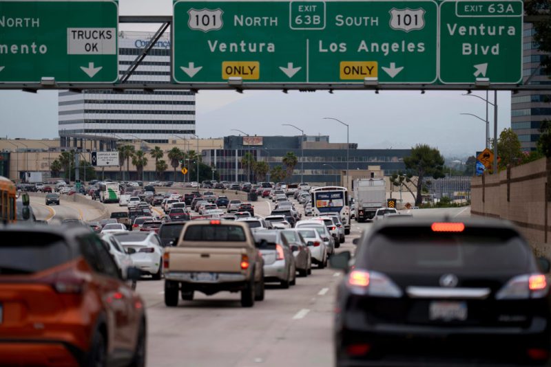
The U.S. has been embroiled in a decades-long debate over the best font for highway signs, oscillating between Highway Gothic and Clearview. Highway Gothic, adopted in 1948, faced readability issues with reflective signs, leading to the creation of Clearview in 2004. Despite initial approval, Clearview's endorsement was rescinded in 2016 but reinstated in 2018, resulting in a mix of both fonts on U.S. roadways today.
Topics:technology#clearview#federal-highway-administration#fonts#highway-gothic#highway-signs#transportation
Reading Insights
Total Reads
0
Unique Readers
1
Time Saved
3 min
vs 4 min read
Condensed
91%
729 → 65 words
Want the full story? Read the original article
Read on WJW FOX 8 News Cleveland