"Zelda Logo Debate: Which Design Reigns Supreme Among Fans?"
TL;DR Summary
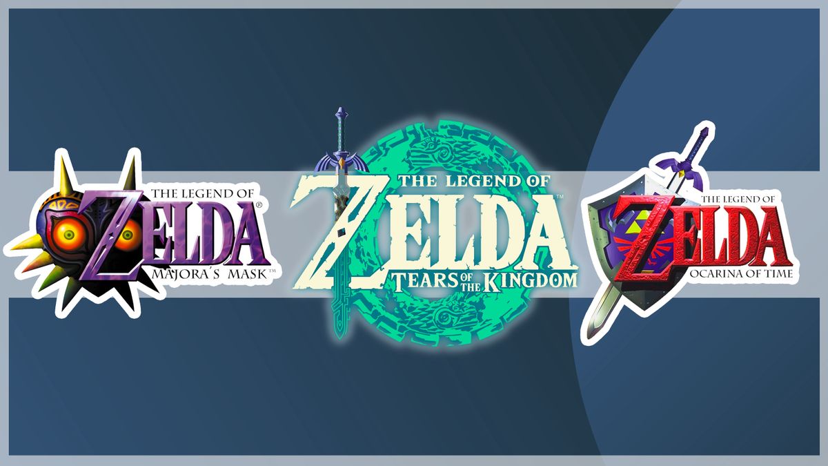
As the release of The Legend of Zelda: Tears of the Kingdom approaches, fans are debating which of the franchise's logos is the best. The consistent typography and various illustrations of each logo perfectly represent the game style. Fans have expressed their love for the Majora's Mask logo for its spook-factor, the Ocarina of Time logo for its nostalgia, and the Breath of the Wild logo for its simplicity and visual storytelling. The Tears of the Kingdom logo, the first all-white Zelda logo, is already a personal favorite for its subtle yet beautiful detail.
Reading Insights
Total Reads
0
Unique Readers
0
Time Saved
4 min
vs 5 min read
Condensed
90%
918 → 94 words
Want the full story? Read the original article
Read on Creative Bloq